Introduction
In the previous lab my group members and I created a terrain out of snow in a 2.34 x 1.12 planter box. This labs purpose will be to the data we collected and input it in such a way that can be turned into a digital terrain model using ArcMap and Arc-scene. Using a variety of interpolation methods, we are to choose which one method which we like best, recreate our terrain and take a more dense point recording of the parts of our terrain that were not portrayed accurately in the original data set. To do this, it will be necessary for us to in some manner shorten some of the intervals on the y and/or x axis. This increased density will provide a better representation of the true terrain. With that new data, a final terrain model will be created using the interpolation method we as group decided represented our surface best.Upon reviewing the terrain models created by using:
- IDW
- Natural Neighbors
- Kriging
- Spline
- TIN
Methods
After analyzing our results from the first data collection, my group members and I decided that we were happy with what 80% of our data, and that 20% remainder was the data from the ridge. As such, when redoing data we determined that the only areas that need to have a finer grid over it was ridge area. We defined the ridge area as any part of the landscape that showed a sharp contrast in height from both of the adjacent valleys. The first thing we did, in preparation for our measurements ,was to recreate our landscape within the planter box as best we could so that it more or less resembled the initial terrain made in lab 1.The replication was conducted on Wednesday, February 10th at 9 AM. My group member Andrew were the two who were to recreate and collect the new data. Alexanders responsibility was to convert said data into an appropriate three column excel file. The conditions were were somewhat mild in comparison to the last collection. There was little wind or clouds, and the temperature stayed at 14 degrees during our 1 hour and 20 minute collection process.
To do this, my group members and I used our hands and shovels to recreate varying hills, slopes, ridges, valleys and depressions. Once we were satisfied with the replication, we used water from a water bottle help compact the snow surface and freeze the formation in place. Doing this allowed for us to be less concerned about potentially damaging our landscape accidental as we took our measurements or created our grid. The next thing we did was create our grid, 10 meters in per interval in the x and y direction, excluding the areas of the ridge which we reclassified as a point per 5cm, not 10 cm, on the x axis. The final product produced a grid made to collect 305 points, compared to the previous lab in which there were 242. We than recollect the data of the ridge by taking measurements from the newly created, more dense, surface grid.
Before creating our final Interpolation model we a s group had to explore the various interpolation models available within ArcMap. Using the original data from lab one, we interpolated our resaults using IDW, Kriging, Natural Neighbor, Spline, and TIN operations. After doing this, we as a group will decide which interpolation models our terrain most accurately, and use that method on our 2nd point data set.
Interpolating the Initial Data - understanding process and discussing results.
IDW: The Inverse Distance Weighted interpolation method determines cell values using a linear-weighted combination of sample points. The weight assigned is a function of the distance of an input point form the output cell. The greater the distance is, the less of an influence the cell has on that specific cell. This type of interpolation requires a high density of data points to to be able to create a a good representation of a surface. As figure 2 displays below, the IDW of our initial data collection produced very lumpy DSM that misrepresented the true surface we created. |
| Figure 2: IDW interpolation |
Natural Neighbors: The Natural Neighbor interpolation method used weighted averages, and is the equasion used to create the model is very similar to the one used in IDW. This method uses local coordinates to define the amount of influence ny scatter point will have on another point in the output of the model. Referring to the map in figure 3 below, the surface created is similar to the product of the IDW Interpolation, but is smoother, and less lumpy. Again, though, the area that is the most different from the actual planter terrain is is the ridged area near the middle.
 |
| figure 3: Natural Neighbor Interpolation |
Kriging: The Kriging method is very powerful statistically based method of interpolation. Kriging assumes that the distance or direction between sample points reflects a spatial correlation that can be used to explain variation in the surface. Its product is produced to fit a function to a specified number of points or all points within a specified radius in order to determine the output value. To get these predicted values , Kriging derives a relationship between points by using sample measurements that use a sophisticated weighted averaging technique. Revering to the Kriging Map below in figure 4, we as a group liked how smooth and gradual this particular DSM produced, and was most similar to the actual terrain of the planter box of all the interpolation methods thus far. The terrain we created had was very smooth, with few if any sharp features. With that being said, the ridge is again misrepresented, and is shown to be not continuous across the the entity of the Y axis, as it was in actuality.
 |
| figure 4: Kriging Interpolation |
Spline: The Spline interpolation method estimates values using a math function that minimizes the overall surface curvature. Spline models are then typically very smooth, and passes directly through input points. In essence, it is like bending a piece of rubber to flow through two points while also minimizing the total amount of curvature between those two points. Very effective at showing surfaces that gradually change over space, like temperature models.
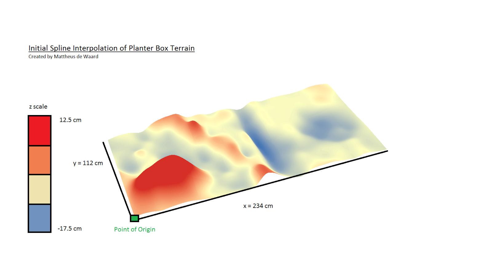 |
| figure 5: Spline Interpolation |
TIN: The Triangulated Irregular Network interpolation is very different from the other methods previously discussed. Uses points to create triangle based geometry that then makes up the surface model. The 3 vertexes of each triangle is represented by the exact location of a data point, and the space between in the plane of the triangle is what is is interpolated based off of the z values of each point. Referring to figure 6 below, the rigidness of the TIN interpolation creates a very sharp and abrupt spatial representation of the planter box terrain. As a group we decided that because of its rigidness, it was poor model for the smooth terrain we had created in the field. With that being said, the TIN interpolation method did the best job at representing the the ridge, which so far has been grossly misrepresented by all the other interpolation methods.

Re-interpolating Planter Surface with New Data
Once obtained, the new data was subsequently loaded into Excel. Each grid space is represented by a corresponding x,y and z value. Once completed, the table was added to newly created personal geodatabase and turned into a point layer.
Next, we had to determine what interpolation and re-sampling measures we were going to employ to get a better result.
The decision as to what interpolation method to use for our 2nd data set was objectively based on which method best represented the majority of our created terrain. Given the opportunity of being able to re sample a portion or all of the planter box, we knew that if we created a finer grid from which we would take our z measurement from, we could fix the misrepresentation of the interpolated DSMs. Coming to that conclusion, we as a group decided to decrease the the distance between grid spaces by shortening the increments to 5 cm as apposed to 10 on the axis for the portion which contained the ridge feature. The data collected can be seen below in the form of a point feature class, in figure 6
 |
| figure 6: Point feature class created from CSV file of collected points, notice the portion of the layer that is more dense. That is the region where the ridge is. |
The decision as to what interpolation method to use for our 2nd data set was objectively decided based on which method best represented the majority of our created terrain. Given the opportunity of being able to re sample a portion or all of the planter box, we knew that if we created a finer grid from which we would take our z measurement from, we could fix the misrepresentation of the interpolated DSMs. Coming to that conclusion, we as a group decided to decrease the the distance between grid spaces by shortening the increments to 5 cm as apposed to 10 on the axis for the portion which contained the ridge feature. With this newly created, denser data, we felt that by using an Ordinary Kriging Interpolation, we could obtain the most accurate results.
Results: Ordinary Kriging of 2nd planter terrain point data set
The final map made was by-far the best representation of any the true terrain created thus far in this excersize. This map can be seen below in figure 7. As you can, see, the ridge is now continuous across the width of the y axis, and variates very little at the point of plateau across its y extent. This, ultimately, was what we set out to do when recreated our terrain and data collection process. Apart from the newly created ridge, we were also very happy with overall smoothness that from the Kriging process. Because the surface that we were working with on our terrain was snow, the continuous, smooth nature of a Kriging DSM, works very well.
 |
| figure 7: Final Kriging interpolation with new data. |
Data Discussion
During our data re-collection, our goal was to condense the point cloud over the ridge in order to create more values that would in turn produce better results with the interpolation. A denser point cloud allows for the weighted averaging operations to model the surface with higher accuracy and consistency. Given that we reduced the size of the grid to produce better results over the ridge on the x axis, doing the same to the y would have lead to an even denser dataset which would further enable the technology within ArcMap to create accurate representations. A concern i have with us only making the x values smaller is that the grid we ended up creating more rectangular over the ridge area. Because they were not uniform squares, this created more room for human error in that we could have been inconsistent in which part of the rectangle we were taking our re-measuremnts. I would like o think that we were pretty consistent, but this factor increases the opportunity for us to add a level of unwanted randomness to our collection process . Another thing that we could have done is been more precise when collecting our z values. For both datasets, we recorded all values relative to the nearest 1/2 cm. Increasing that precision to the 1/4 cm would have even furthur increased the precision of our data, and would further able the computer models to produce more accurate results.
No comments:
Post a Comment