Tuesday, May 10, 2016

Lab 11: GPS Navigation at the Priory

Introduction

On May 3, 2016, The class met at the university owned plot of land known as the priory for a exersize in GPS and map navigation.  Using these two tools, students podded together into groups of 3-4 and used them to navigate to a list points given to the groups by Dr. Hupy.  Before embarking out and using the GPS to find these meter based UTM locations, the group was to project the predicted locations of these points using the maps made in a previous lab, relying solely on the grid produced in the navigation lab which was conducted earlier in this course.  Once that was done, the group was to plot out the points assigned while also keeping a track record of the path that was taken en route to the points provided.  The use of tracks was intended to help the students refer back to in the difficulties they may have faced in a certain portion of their navigation.  Once complete, students returned to the parking lot and reconvened with rest of the class.  Before leaving, the groups stopped the GPS tracking session and gave the devices to Dr. Hupy.

Study Area

The Priory is located just south of the city of Eau Claire.  The property is composed of a cluster of buildings that are used as both dorms and teach facility.  Apart from the green space surrounding these buildings and the black top parking lot, the property is mostly covered in forest and other vegetation.  A majority of this forested area is on a hill which slopes down away from the priory's buildings.  Apart from the entrance road, 3/4 of the land surrounding the priory has this characteristic.  Below in figure 1 is the original navigation map that was made for the initial navigation map.

Figure 1: Priory navigation map with UTM grid (left map) and decimal degrees (right map).
As you can see by the map on the left, a majority of this surrounding land is on a major incline and is mostly forested.  As the discussion of this lab develops the difficulties of traversing this land will be discussed as it pertains to both the the topology and land cover of the area.

Overall, the conditions for completing this navigation event were very mild.  Despite a small bout of rain that lasted about 5 minutes, the conditions more or less ideal for hiking.  The wind was minimal  and the skies were partly cloudy, keeping the heat of the sun at bay.  On a personal note, a wore long sleeves and sweatpants.  This caused me to be a little warmer, but was helpful in that it protected my body from the branches, buck thorn, and ticks that were ever present throughout the navigation even. The entire process of collecting our point locations took roughly 2 hours. Let us now look at the specific locations collected by our group and the tracks that were recorded between the collection of our points.  Below, in figure 2, is a map accompanied with a series of images that show the adventure that our group embarked on.

Figure 2: Map of tracks and navigation points assigned. All pictures taken by group member: Audrey Bottolofson 
Now the challenges attributed to each point will be discussed in terms of the terrain.  Starting off with point 1: The main challenge associated with the first point was getting our bearings with the GPS.  When that was sorted out, and we could deem which way was North,South, East, and West, we took off. We knew that the location was down a sizable hill will large brush in the way, so we worked to the north and tracked back south to avoid the steepest part of the hill and the thickest part of the vegetation.   After finding that point, group member Ethan noticed that point 3 was closer to us than point 2, so we decided to find that first.  There really wasn't too much of a challenge here in terms of terrain, since we as group followed the open road with and cut back through the planted forest which presented very little obstruction from plants or hilly terrain.  The next point, point 2, had similar ease of access, but the group got a little disoriented due to a misreading of the coordinates, hence why the track indicates that the group went far south, before tracking back and heading into the forest.  The easiest point of all to find was point 4, and that was because we saw this point on our way down to the path on our way to find the first point.  Between point 4 and point 5, there was a steep hill with very thick vegetation. As such, we decided as a group that it was best to go up the path, and approach the final point from a higher vantage point, where the terrain and vegetation could be better assessed. This strategy proved to be worth it because not long after getting to the top, we were able to traverse a trail that allowed us to look down hill and spot the 5th and final marker.  Between many of these points, there was some level of back tracking and wondering to gauge the GPS unit to provide our group the necessary orientation to provide us with the correct barring to the next point. 

Methods 

To find our way through this landscape, the group made use of a Etrax GPS unit to find the way from point to point.  The main thing that we had to establish was how the numbers changed when we went certain directions.  For example,  If we went due South, we knew that the Y UTM value would decrese, vise versa if we went due North.  For longitudinal direction, we knew that if we went east, the value would decrease, and increase if we went West. As such, looking at the numbers relative to our current location, we knew the general direction we would than have to go.  After that was determined, we than assessed what obstacles would be in our way in terms of vegetation and topology as we travled, and planned accordingly as the best way to avoid these areas, without going to far out of the way 

Avoiding vegetation was especially important since 1/2 of the 4 group members were dressed in short sleeves and shorts.  Even with our best intentions of avoiding thick vegetation, the group members who wore the less covering suffered from the buck thorn and branches, and by the end of the day had their fair share of cuts. 

The group took turns holding the GPS unit and guiding the group in the right direction.  The main screen that was used during this process was a page that contained a compass and a real time update of  the GPS's current UTM location.  Taking turns, each group member gained experience working with the Etrax and continually applying a geospatil brain to thinking of current orientation/location in terms of where the group desired to be. 

Conclusion 

The experience gained from this lab was useful in that it encouraged working as a team to provide a conjoined brain of geospatial understanding.  As a team we were able to check each group member to make sure that the group was moving and traversing as efficiently as possible.  Most of the time the group was on track, but at times another member had a realizazion relative to an error being made and spoke up.  This often times saved the group allot of time since had the group continued with the same route or approach, they would have continued on in the wrong direction and would have had to spend large amount of time correcting the route and making up for time loss. 
     

Wednesday, May 4, 2016

Lab 10: Processing Unmanned Aerial System Imagery with Pix4D Software.

Introduction - Part 1: Get familiar with the Product

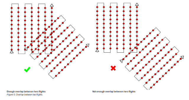
What is the overlap needed for Pix4D to process imagery?

The recommended overlap used in Pix4D is 75%

What if the user is flying over sand/snow, or uniform fields?

When working with ununiform surfaces, it is recommended the overall overlap of images should be increased: minimal 85% frontal and 70% lateral.

What is Rapid Check?

Rapid Check reduces the resolution of the images used in a project from their original pixelation to 1MP.  As a result, operations can be run faster but as a result produces lower global accuracy because there are less overlapping pixels which can be match to one another because there are now less pixels per image.  This often done to check the overall quality of the data consumed by the device.

Can Pix4D process multiple flights? What does the pilot need to maintain if so?

Pix4D can processed datasets composed of multiple flights provided that the total number of images is less then 2,000. Just as will the images from one dataset, when combining two sets from different flights there must be the appropriate amount of overlap between flight paths and images. figure 1 exemplifies the amount of overlapping flight area is necessary:

figure 1: appropriate image acquisition plans for combining multiple datasets composed of more than 1 flight mission.


Can Pix4D process oblique images? What type of data do you need if so?

Yes, Pix4D can process oblique imagery.  To do so, two different flights need to be ran.  One flight at a higher altitude, with a oblique angle of 30 degrees. The second flight needs to be at a lower height, with a camera angle around 45 degrees.  This is able to create a point cloud, which is good for modeling buildings, but cannot create a complete orthomosaic.

Are GCPs necessary for Pix4D? When are they highly recommended?

The answer to this question depends upon the users application and how much accuracy is necessary to complete the task.  If working a construction based project, accuracy is of high importance and GCPs need to be accurate to the centimeter or less.  If the application is for agriculture purposes, GCP accuracy is not as important and need only be accurate on a meter scale.

What is the quality report?

The quality report is a report that provides detail about the operation just conducted by providing a summary, quality check, and preview of what is being created.  The summary is perhaps the most important because it tells you important information about your images like the amount of overlap produced and average ground sampling distances.  figure 2 below shows the an example of a quality check

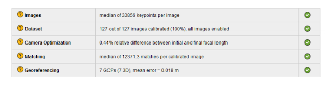
figure 2: Quality report check.  Green checks mean that portion of the check has been passed.


Part 2: Methodology of Using the Pix4D Software

Initial set up and processing

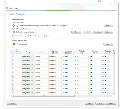
In order to run a Pix4D project, there are sometimes several user inputs that need to be carefully attended to by the user.  Some sensors have there metadata saved within the Pix4D program, like the Cannon SX290.  If the sensor is not in the programs memory, like files coming from a GEMS sensor, the specifications about the camera must be input manualy into the software. Optionaly, this is also where you would enter into the software information about GCP positions

Along with camera specifications, some sensors, like the Cannon SX260, upload their images with their coordinates already attached to the file.  Other sensors, like the GEMS, require that you assign a text or CSV file via a join to these images.  In either case, once coordinates and camera specifications are established, Pix4D can now create run its initial processes.


Creation of 3D mesh, Point Cloud file, and Project Data

After initial processing, Pix4D begins to create files that will be apart of both the output and the creation of the DSMs and mosaics later on.  First what is created is a 3D_mesh fiel, which stores 3D textured mesh in the formats selected by the user. After that, a densified point cloud is created in the format selected by the user.  lastly, a file creating the project data is created.  This file contains information need for the software to create run ceratin oppetaions correctly, and create summary reports relating to the project. The creation of these outputs, is all apart of the Point Cloud Densification process.  A Point Clound Densifcation report is created upon the compleation of this processing event, and is made available as apart of the final Quality Report. 

Within the report, the Point Clound Densifcation Details would look similar to what we see here in figure 2:

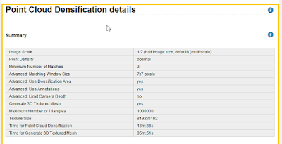
Figure 3: Point Cloud Densification Summary.  Apart of the quality report.

DSM and Orthomosaic Creation

In this final process of creating the Pix4D project, the DSM and Orthomosiacs are created using the inputs of the user, data from the sensor, and files created in previous processessing opperations.
In a folder called 3_dsm_ortho, the following folders are made:

  • 1_dsm: stores raster DSM and grid DSM in the format specified by the user
  • 2_mosaics: Stores orthomosaic with transparency capabilities.  If specified by user, tiles and map-box tiles are also stored here.
  • extra information (optional): If specified by user, will create and store contour lines.  Is not generated by default

Final Quality Report

Stored within the 1_initial folder, contained within the project file, a final quality report pertaining to the project will be produced and held.  Within this report, Pix4D provides summary information about the quality of the project and how well the the software was able process the data from the sensors.  The Report contains a number of figures, tables, and diagrams pertaining to how well the data was collaborated, mosaiced, and geo-referenced.  The Report also contains all the saved information about what specific user inputs were applied to that specific project.  Another helpful thing that accompanies the report, is a preview of of both the orthomosaic and DSM created by the project.

Reviewing Pix4D products from GEMs and Cannon SX260

Creating the projects, and the time assoicated with running the standard operations of Pix4D, took a long time.  Each project took roughly 1.5 hours to complete, and some times the result was to poor to even use.  This was only the case with the GEMs files that were using.  After working with 2 datasets that were producing very lumpy data, it was clear that something was wrong with the data collected during those specific missions.  After producing two projects with GEMS imagery that were unusable, a third dataset finally worked and the results were of a higher quality.

The Cannon SX260 project transpired very smoothly, with no need to attribute text or CSV files to provide coordinates for the images, the project produced good results on the first round of computation.  For the GEMs imagery, a separate text file had to me applied to the imagery when creating the projects to provide a spatial attribute to each image.  This file is created when exporting the imagery collected from the GEMS, into pix4D. So although there is an extra step in creating the project, the process is still very straight forward and simple.  Below, in figure 4, we see what the GEMS data looks like prior to being processed, without ant attributed geolocation/orientation information

figure 4: GEMS images before being assigned coordinates

Such data, by itself, is useless to us.  In line with the Geolocation and Orientation tag - is a button that says 'From File'.  Clicking on that tab, one can select a CSV file that should be in the folder of the dataset created when the imagery was exported to Pix4D.  That folder by default is labeled export, and contains a different CSV for each different set of imagery (Mono,RGB, NIR).

After selecting the appropriate table, the user must select the file format, which is essentially the order of geographic reference, as they are displayed in within the CSV file.  because of this, the user should open the CSV file before assigning it to the images in Pix4D, so that they know what the format is, and don't end up entering the wrong order and population your images with incorrect spatial reference.  Below, in figure 5, we see the correct locations for each image in terms of GCS lat - long.

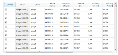
figure 5: A portion of the geolocated images from a GEMS sensor 
Another thing that often times needs to input by the user, are the camera specifications. Some sensors, like the Cannon SX260, will populate these fields for the user as their imagery is uploaded. Other sensors, like the GEMS, do not feature this quality, and must be input manually. below in figure 6, is an example of the type of specifications required by the software to run a project.

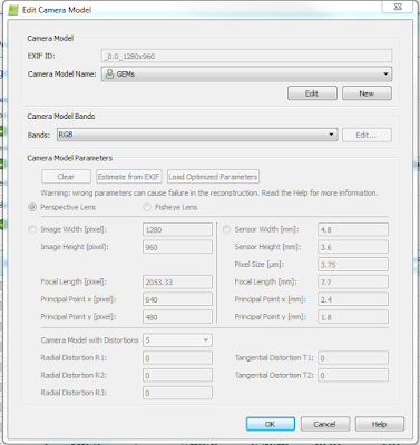
figure 6: Camera inputs for Pix4D

Reviewing and discussing the data with Quality Reports Created for GEMS and CannonSX260 projects in Pix4D.

Cannon SX260

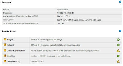
figure 7: cannon SX260 summary 


Here in figure 7, above, one can view the SX260 specifications and the quality check conducted after the initial processing process of the Pix4D project  creation.  Of the 108 images input for this this project, 105 were able to be calibrated and used to create the orthomosaic and DSM.   After examining the data in Pix4D, the area where there is no calibrated imagery is a wooded area of dispersed trees and other vegetation.  This is likely the case because trees are very dynamic in their shape, trajectory, and pattern, and would thus be very poorly represented 

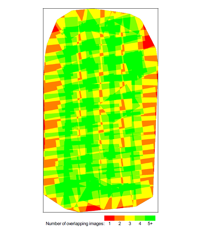
The quality report also provides a diagram showing how much overlapping imagery there is throughout a mission.  Figure 8, below, displays these areas. 

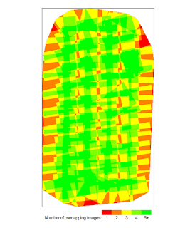
figure 8: amount of image overlap for cannon SX260


Referring back to figure 8, the areas with the lowest amount of overlap are at the bottom and to the right of the image.  The low number of overlapping imagery was likely known before the mission, and was allowed because it was not of high importance to the grand scheme of the mission.  Had the mission done one more pass over these given areas, the amount of overlap would be higher than what we currently can see. 

GEMS


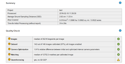
figure 9: GEMS specs and quality check 


Here in figure 7, above, one can view the GEMS specifications and the quality check conducted after the initial processing process of the Pix4D project  creation.  Of the 146 images input for this this project, 142 were able to be calibrated and used to create the orthomosaic and DSM.   After examining the data in Pix4D, the area where there is no calibrated imagery is a wooded area of dispersed trees and other vegetation.  This is likely the case because trees are very dynamic in their shape, trajectory, and pattern, and would thus be very poorly represented. 

Relating those images that were not calibrated to wooded areas, let us observe the overlap diagram produced by the quality report for this project in figure 10 below.

Overall, there is a very high degree of overlap for almost the entire area.  However, with that being said, there are are areas outside of the edges of the mosaic that have poor overlap.  The areas being referred to are the right-central location and a the thin line that crosses the upper portion of the AOI.  relating this to the orthomosiac produced, both these portions that resemble areas of poor overlap are forested areas, and are not represented in the final orthomosaic, they are blank spaces blotted through out that area.  

Comparing the two projects, the GEMS mission has a much more dense level of overlap compared to that of the Cannon SX260 mission.  This is not a comment on the sensors capability, but is refering too the difference in mission planning that likely took place.  The area of interest for the GEMS mission is much more dynamic and changing, and thus would require more overlap to create an accurate orthomosaic and DSM.

Ray Cloud: Measuring Areas and Distances in Pix4D

The ray cloud tool utilizes the multiple angles and distances of the various images  taken to provide accurate 3D areas and distances of user created polygons or lines.  The key for this tool to be accurate, is having the same area as overlapped from different angles and distances as possible.  Here are a few a measurement oppertations conducted using the data produced with the Cannon SX260. These measurement features were later exported to ArcMap, and are apart of the maps compiled later on in this lab assignment

Line Measurement
Line measurement is a helpful tool for both applying the software, and quality checking data. In this instance, the tool was used to measure a straight portion of a track which has a known length of 100 meters.  Going from line to line, the results were as such:

Terrain 3d length: 100.60 M
Projected 2d lengh: 100.55 M

The discrepancy between the distance recorded and the actual distance of the track (100 M) is likely due to the distorted pix-elation that occurs at close levels when zoomed at high levels onto the track.  Figure 7 shows what is meant by this with an example of the distortion.

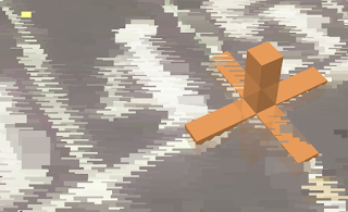
figure 7: distortion of cannon SX260 point clouds in Pix4D
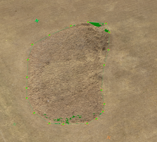
Area Measurement
Measuring the area of a given space is also a helpful tool made available through the rayCloud tool. After an area is created, a toolbar on the right shows the multiple angles the area created can be seen through the vantage point of the different images that have an overlapping viewing area of the same portion of the surface.  Using these images, the user can subsequently alter the vertices of the polygon the polygon they created.  Here are the specs of the area captured in the middle of the open field next to the track at South Middle School. 

Enclose 3d area: 705.50 square meters 
Projected 2D area: 656.72 square meters 

Here is the area which was recorded and produced theses values.

figure 8: area captured using rayCloud in Pix4D 
Volume Measurement  

The final thing that one can do using rayCloud is calculate interval volume measurements of areas or items that are apart of your surface.  The volume value can either be positive or negative, indicating weather the the mass of the measured feature a divet in the surface or something that occupies space above the surface.  Similar to what you can do with the vertices in area measurements, the user can also view the feature they created in all of the images that overlap that area of the surface, and can subsequently alter the vertices as they see fit.  The area measured for this example was a drainage ditch-like divet between an open field and the parking lot.  here is what this area looks like and its subsequent volumetric measurements.

Fill volume: -41.37 meters cubed (+/- 5.45)
Total volume: -40.94 meters cubed (+/- 5.85)

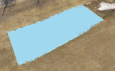
figure 9: volume area of a drainage ditch processed in Pix4D

Final Maps 

by exporting these maps to Arcmap, the files ore oriented and can me made into maps.  Figure 10 and 11 below show the maps made from the GEMS and Cannon SX260, in that order.


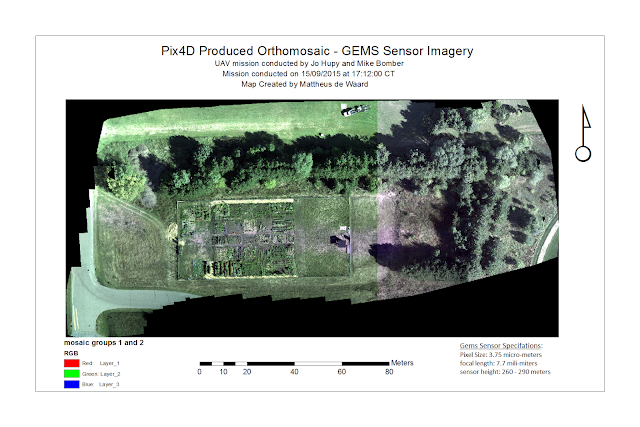
figure 10: GEMS mosaic

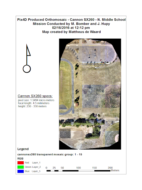
Figure 11: Cannon SX260 mosaic

Conclusion 

Pix4D is a powerful software with very useful open source capabilities.  Being able to upload imagery from a wide array of sensors and subsequently process the data within those images into a product that can be used for any number of applications across a wide range of various industry needs is what sets it apart from other software, like that of the GEMS, which we have already worked with. Software with GEMS, is only very useful when working with GEMS hardware. Pix4D, on the otherhand, may have a few more user inputs required to create meaningful results, but is a much better tool for someone who is more verse in remote sensing with imagery captured from a UAS.  The results produced were of high quality, and most importantly, through using the software i was able to gain a better understanding of the technological nuances of creating orthomosaics and DSMs. 


Tuesday, April 26, 2016

Lab 9: Topographic Survey with a Total Station.

Introduction

In last weeks lab previous lab, students conducted a survey using the TopCon station to collect feature locations. This method was rather simple, since all of the features  were in an open area with little to no obstruction from land forms of building for satellite triangulation.  Sometimes, however, a situation will call for more accuracy in  X, Y and Z (elevation) locations.  Just as well, sometimes a survey will have to be conducted in area in places where adequate triangulation will be hard to get (like in places right next to a building or at the bottom of a long/steep slope).  In either case, an approach that could be taken is to do a topographic survey using a total station, which is what this lab activity teaches students to do.  In the sections to follow, the methods and results of a total station topographic survey will be outlined.  Following the methods and results, there will be a discussion about this specific method and the specifics of the lab conditions, and ultimately end with a conclusion giving a full rundown of the newly acquired skills from the laboratory activity.

Study Area 

In this particular lab demo where students conducted a topographic survey of the landscape  on the Phillips Science Building's North Lawn using a total station.  The study was conducted by the full class, and was guided in part by Professor Jo Hupy.  The surveying began at roughly 325 PM and ended at around 530 PM.  The conditions on that day, April 19th, were wet, with on going rain.  The temperature was not to cold, however, and hung around the 60's.  Toward the end of the survey the rain did dissipate and the temperature began to raise, but just slightly.  The specific area where the survey was an area to the North West of the main body of the Phillips building, and to the North East of the Davies Center building. Cutting through the study area is the Little Niagara Creek, which runs East/West through the campus.  The land on both sides of the creek gradually moves from more consistent level ground, into a gradual slope as the land approaches the creek.  Trees were surveyed from both sides of the creek.   The point from which data was recorded was on the south side of the creek. At the time of the Survey, there was heavy foot traffic as students were coming and going from their classes, the atmosphere was someone chaotic and high paced as many were trying to escape the damp and cold.  

The point that anchored this land survey was anchored was on  grass portion of the campus mall.  The viewing station was anchored in the same place, and it was very important that students not move any of the legs or move the base of the device.  directly to the west of the station, not more than 3 meters away was the TopCon Differential GPS and Tesla Home Station device, which were connected to the viewing station via a blue tooth connection. below in figure 1 is a map that displays the general area that composed the study are for this survey.

Methods

Field Collection


The collection process of the data for this lab, much like last weeks lab, involved groups of two or three going out into the study area with Dr. Hupy to get one on one instruction on how to work with the equipment.  Before going into the details about data collection, let us first look at how this type of survey is done and what must be accounted for in order to produce meaningful results. because the viewing station has no spatial reference system Incorporated within it, before conducting a survey one must collect back points to provide the system directional points to go off of.  This was done using a GPS the TopCon Survey GPS.  These points provide directional orientation for the total station to get the most accurate results.  Ideally,  one would collect a breadth of back points at varying distances and orientations relative to the occupied point, which is the the precise location of the total station during a survey. Like with ground control points in remote sensing, the more back points a total station survey uses, and the more diverse their orientation, the more accurate your survey will be.  Similarly, it is very important that while establishing back points and conducting a survey that the total station not be moved at all, the occupied point must remain in a steadfast location and orientation in order for the survey to have a meaningful output.
figure 3: TopCon total station
figure 2: Prism at the top of adjustable point rod
The actual collection of the data points was conducted in groups of two, and each group took roughly 20 points with each partner taking turns using both the total station and prism rod.  Figure 2 and 3, to the right, show what each of these components look like.  The total station communicates the data collected via Bluetooth to the Tesla handheld field unit.

During the data collection process, one student would take the prism rod and move about as instructed by Dr. Hupy and the other student would aim the viewer on the total station to line up with the circular portion of the prism, trying to get the cross hairs as central of the total station as centered to the middle of the prism as possible.  When lined up, the student running the total station would tell professor Hupy, and using the Tesla handheld unit (which is connected via Bluetooth to the total station) would command the total station to record/save the information in the the Tesla's memory memory.

Processing Data in ESRI

From the data collected by all the groups, a text file was created containing the UTM easting, northings, and elevation values collected during the time in the field.  With that data, students were to input that data into ArcMap and interpolate it into a raster format using any method they so desired.  Before this was done, the text file was converted into a table and all extra fields other than an ID, X, Y and Z field were deleted.  Once that was complete, the table was exported into a geodatabase and turned into point features using the XY to point tool.  

Now that the data has been turned into a feature class, the points elevation values can be used to create a surface raster.  The Interpolation method that was used was IDW interpolation.  Once complete, the data was manipulated to show relevant significant digits and symbolized in a way that best represents changing elevation.  

Results

The resulting raster shows how the landscape around the Little Niagara Creek slopes down until eventually meeting the water. Figure 4 below shows the raster created that represents the elevation changes within the AOI.


Figure 4: Map showing elevation survey of a portion of Little Niagara Creek's Bank 

Discussion 

Despite this lab being a good introduction to the methods and techniques associated with conducting land surveys, there are a couple of discrepancies associated with the data collected.  The data indicates that the landscape is more or less a sink hole rather than a continuous bank that converges onto a creek.  The data is displayed as such because of obstacles on the both the eastern and western edges of the AOI that prevented students from taking point locations of the ground. To the west, there is a good bridge that hangs low over the water that blocks students from getting a reading of the ground height near the waters edge.  To the east, thick brush covers the ground until it eventually runs the land around the creek converges to a very small strip of land between the Phillips science hall and the creek itself.  Because no/few points were taken near these edge locations, the interpolation of the raster aggregates the higher elevation values from the more open areas further away  from the bank, thus producing the perceived sink whole seen in the raster created.

In terms of the survey set up, this survey only employed the use of 3 back points relative to the occupied point.  In actual survey, this would not be acceptable as there needs to be a much more wide range of points.  So although the survey yielded data that produced points that overall showed lower elevation near the creek and higher elevation away from it, its hard to comment on the accuracy of each point in the X/Y direction because so few back points were used to orientate the total station.  Had more points, there would be much more confidence in the accuracy of the data. 

Conclusion 

Becoming familiar with such a highly accurate technology is a very valuable skill to have for ones geospatial tool kit as surveying work can become a very useful tool to have.  Some times a GPS unit will not have the triangulation capabilities to locate itself over and and over again in the field, and by using this equipment, a full survey can be conducted using angles and distances from a single known point, allowing for collection to occur in hard to collect places where triangulation would otherwise be difficult, thus making traditional methods of simply collecting points with a GPS unit be impossible to do.  


Monday, April 18, 2016

Lab 8: Topographic Survey of UWEC's Southern Portion of Lower Campus

Introduction 

For this lab exercise, students were paired into groups of two to conduct a topographic survey of the University of Wisconsin Eau Claire's Lower Campus.  During the lab, groups took turns going out onto the campus mall with Dr. Hupy to take point locations of a combination of lights, trees, garbage cans, or bike racks.  To take these measurements, a highly accurate Top-Con survey grade GPS device was used to create these point features.  The partner that I was to conduct my survey with was Andrew Faris, and we were the the 5th group of 6 to go to the field and conduct a survey.  Once each group has collected their points, the class was then to combine the data collected from all the groups into one, complete dataset, and export the data into ArcMap where it can be converted into a features that represent the totality of what the class collected. 

Study area and Methods 

The Area where this Activity was conducted was on the lower campus of the University of Wisconsin of Eau Claire, in and around the parking lot that is located to the south of both the Phillips Science Building and the Davies Center.  The device which was used to collect the features in this area was a TopCon Survey Grade GPS unit.  In past activities, GPS units were used that provided accuracy that could be off by a meter or more when pinpointing locations.  The TopCon utilizes RFC technology that can provide sub centimeter accuracy. 

This device comes with a complete built in interface that allows for the user to manipulate the data being collected in the field in real time.  Apart of this interface is a reassembled set of field attributes that identify the point of which is being identified with the device.  By doing this, exporting the data into a GIS software program becomes very symbol, and essentially only requires that you bring it into a geodatabase, provide appropriate symbology, and than make/publish the map the document that shows the location and desired attributes of each feature. 

Collecting the point locations was very similar to using a small handheld unit or cellphone, except for the fact that the TopCon set up is much more bulky.  The device from which the user selects the inputs and other options is a Tesla unit that is about 8 inches wide and 4 inches high.  The Tesla device is portable, but during survey operations it is mounted to a tripod.  Atop the tripod is a the GPS device, which is securely mounted to a long pole with a fixed l.  The GPS atop and the Tesla communicate via a MiFii device which is connected to the 4G network.  Figure 1, below, shows the full set of components that were used in this field operation. 


figure 1: Top Con Survey Grade GPS Unit
The GPS unit atop takes the point location from the geographic or projected coordinate system specified by the user prior to the beginning of survey activity.  The x position, Y position, and Z (elevation position) are taking from the point where the middle black pole in the middle meets the surface below.  The other two poles, seen in figure 1 as the poles colored a bright yellow color, provide support as steaks that can penetrate the surface if the ground material a soft material.  Using these three legs, the users need to adjust the legs until the device is level.  To aid with this process, the tripod is equipped with a bubble leveler near where all three legs meet.  Doing this helps assure that the GPS unit collects the most accurate point possible.  

Collecting the point is a very simple process as well, All that one needs to do is select the feature they are mapping, using a touchscreen pen.  Once you have a feature type selected, and have a confirmed GPS fix from the satellites above, a point can be taken with the simple push of a button.  Collecting a point can be done by simply having the device take a single point, or by taking the average of a specified number of readings.  In the instance of this lab acclivity, the point that was recorded was recorded as an average of 30 points per feature identification.  This was not done in this activity, but the Tesla station also allows the user to take a picture when taking a feature location, which would than be attributed to that point location when exported into a computer desktop. 

In terms of the collection process, this was done during a single class period on April 12th, 2016 in groups of two.  Dr. Hupy and the departments GIS technical adviser, Martin Geotell, took two students at time into the study area to get experience doing topographic work with the TopCon station.  The collection process took roughly 1.5 hours, and was a smooth and easy process since there was no inclement weather (partly cloudy at around 55 degrees F) or technical issues.  

Once the collection process was complete, the locations and attributes were provided to students by Dr. Hupy as a comma delineated text file, which was than imported into excel so that it could be turned into a table.  Once in table format, the table could be imported into a geodatabase, projected to WGS 1984 UTM Zone 15N, and shown as features using the XY tool. 

Results

Below, in figure 2,  is a map of the features collected from the topographic survery that was conducted on a April 12th, 2016 using the TopCon total station. 

Figure 2: Topographic UWEC campus survey

Conclusion 

The TopCon total station had failed on students in the past and it has since been fixed with a new and improved interface.  When functioning, it is a very smooth and intuitive tool that provides users with sub-centimeter locations of features  in a variety of geographic/projected categories.  Such a knowledge of this tool will be useful going forward working with construction based projects where highly accurate GPS data is required as apart of a project.  


Monday, April 11, 2016

Lab 7:Distance/Azimuth Tree Survey: UW-Eau Claire Campus, Phillips North Lawn

Introduction 

Much of the field work that is currently done in the professional geospatial industry is contingent upon the full functionality of the newest, shiniest technology.  The thing is though, with these amazing tools come amazing headaches, and at times the technology can completely  fail the user, and become useless.  When this happens, one must resort to more traditional methods of geospatial surveying to complete the task assigned.  With that being said, the method that will be discussed and demonstrated in this lab does still make use of some electronic technology, it can still be done with tools that are completely independent of electronics/satellite connections.  This method is what is known as a distance-azimuth survey, and it is conducted by taking distance and azimuth degree measurements from a single/known point.  With this information, after a few simple operations in ArcGIS, the locations of what ever it is that is being recorded  can be identified with moderate accuracy.   In the sections that follow, methods and results will be discussed that pertain to a distance azimuth survey that was conducted on Tuesday, April 5th, 2016.  

Study Area

In this particular lab demo, students conducted a distance azimuth survey of trees on the Phillips Science Building's North Lawn.  The study was conducted by the full class, and was guided in part by Professor Jo Hupy.  The surveying began at roughly 325 PM and ended at around 440 PM.  The conditions on that day, April 5th, were cold and damp.  The weather was roughly 35 degrees, with gusting winds and a constant drizzling rain that lasted the entire survey.  The specific area where the survey was an area to the North West of the main body of the Phillips building, and to the North East of the Davies Center building. Cutting through the study area is the Little Niagara Creek, which runs East/West through the campus.  The land on both sides of the creek gradually moves from more consistent level ground, into a gradual slope as the land approaches the creek.  Trees were surveyed from both sides of the creek.   The point from which data was recorded was on the south side of the creek. At the time of the Survey, there was heavy foot traffic as students were coming and going from their classes, the atmosphere was someone chaotic and high paced as many were trying to escape the damp and cold.  

The point that anchored this distance azimuth survey was anchored by a man made crack that was created as a gap between slabs of concrete on the sidewalk, directly adjacent from a light pole.  The light pole was intended to be the anchor point of this distance azimuth survey, but was changed to the crack because at its widest point, allowed for people to stand unobstructed by the pole. The crack was roughly a foot and a half long, on one side was grass and on the other side, a complete concrete slap. This was useful because one could place there feet at the edges of the crack, with their toes behind crack, and make consistent measurements from the same point.  Below, in figure 1, one can see the general layout of the study area.  It should be noted, however, that the trees shown in this map do not highlight any part of the trees that were used as apart of this survey. 

figure 1: Study Area for Distance Azimuth Tree Survey.

Methods - Part 1: Collecting Tree Data 

To conduct this survey, the class needed to record three things in pertaining to each tree. The distance from the anchor point in meters, its azimuthal location on a scale of 0 to 360 from the anchor point, the trees common name, and the diameter of its trunk. The distance measurements were taken by two separate devices.  One device was a pulsating device which recorded distances based off of sound pulse that was originated at the anchor point and traveled to the tree where another student was holding a counter part of that device, which than deflected the sound back to the main device.  Given that the speed of sound is relatively constant, the time between when the pulse leave the device, bounces off of the the counterpart, and returns, providing a distance value between the the observation point and the tree. This distance provides distance and distance alone.  However, the second device, which makes use of a laser and an internal compass, provides both a distance and an azimuthal direction. 

In terms of measuring the width of tree trunks, this was done with a simple measuring tape with a hooked end. The hooked end allowed for the measures to stick the tip into the wood, where it remain steadfast in the bark, while the rest of the tap could be rapped around the trunk to record the distance. The identification of the tree was done by relying on the good judgement of the professor.  

Since the class was all recording the information individually, there needed to be someone to relay the information  from the the party that was conducting the tree girth measurements and species types, to the others by the anchor point. After about two tree measurements, the two students that were accompanying the professor would switch out, and the two that were previously with the professor would join the others.  This ensured that everyone would would have experience with all components of the equipment.

Once professor Hupy dubbed the survey complete, students than returned inside so that the classcould record the data into a digital format in ArcMap.

Part 2: Creating Data in ArcMap

Now that the dataset has been created of trees in the Phillips North Lawn, the class can now input this data into an excel table so that it could be turned into features and eventually mapped.  Figure 2 below shows the table that was made. 

figure 2: table that was made in Excel from data collected in the field.  The X and Y field are all the same values because that represents the anchor point 
Once the data was in this digital format, it could then be turned imported into a geodatabase in ArcMap and be transformed into a recognizable set of features, relative to the data that was mapped.  With that, now the workflow will be laid out as to how to create the features desired from this survey.

1. Using the Barring Distance Line Command, input the table and populate the X, Y, Distance, and Bearing fields appropriately. 

2. The output of this operation will be the lines at the appropriate distance and bearing from the anchor point, as seen in figure 3 below.

figure 3: output of distance to line tool
3. Now that this feature has been created, students were to use the feature vertices to point commands to create the endpoints at these lines that represented the tree locations. 

4. Within this tool, the input needs to be the feature that was previously created using the barring distance line tool. 

5. VERY IMPORTANT - change the option at the bottom titled "point type" from 'all', to 'end'. Doing this populates the outputted field with the right number of points.  Leaving this option as all will create two points, one at the beginning and one at the end. 


figure 4: output of feature to vertices to point tool

6. The output of this tool will create the point locations of the tree locations. figure 4 to the right shows these points, with out the lines which provided them. 

7. Now the feature that were desired have been created,  however, the fields associated with these features are not complete.  This point field does not have the species or tree width attributed to the original data. 

8. To complete this feature, it will be necessary to conduct a table join with a table that contains this information.  The join for this field should be based of off Tree_Number.

9. Export the feature to make the join permanent.  The best place to export the feature to is the geodatabase that has been used prior.

10 (optional).  If publishing these feature to web service, project the feature to web mercator.  

Once this is complete, the final feature is a point location with all the data that was recorded at the initial onset of this survey.  

Results and Discussion 

Below is an embedded map that shows  the results of survey.  The point locations visible are tree locations.


as you can see, there are some clear discrepancies in the location of these trees.  This is likely as result of human error, since most of the class had never conducted a survey such like this, let alone work with the equipment ever before.  It is more than likely that somewhere in the process, one, if not all of the students made an error in producing the data with the equipment at hand.  In that sense, this lab could be viewed as a disappointment. However, looking past these errors, with more practice and experience on individual levels, this sort of skill set could be very useful in the future, for it is never easy to predict when and where technology will fail.    

Conclusion

A distance/azimuth survey is handy skill for any survey technician, GIS specialist, or all-purpose-geographer to have in the toolkit.  In this day in age, technology is a crutch that we tend to depend on very heavily, often to a fault.  When it fails, there is a tendency for users of the technology to give up and say today is not my day, and wait for the technology that was intended to be used in the survey to be available for use again.  This is sometimes necessary, but if able one could consider using this method to save the the time that it would take to leave the sight , fix the equipment, reorganize and return to the field sight.  Being able to operate with lower grade technology is a skill in itself, and this is just one example of how it can be helpful 

Monday, April 4, 2016

Lab 6: ArcCollector Data Collection - Street Lights of UWEC off Campus Housing Area.

Introduction


In the previous lab, students used ArcCollector to collect microclimate data in small groups of 2-3 during a portion of a class period.  This activity was mainly tailored to get students familiar with the interface of the mobile software while also exemplifying how easy the process of combining the classes various data sets was.  Prior to this activity (lab 5) being started, a geodatabase was created for students which was then exported to ArcGIS online and accessed through collector - students had to do very little initial set up prior to collecting data.  In this lab, however, students will have to formulate their own geodatabases and collect their own data with the intent of illustrating a certain geographic trend or answer a particular question, with a geographic scope.  

The power of Arc Collector is that it is intertwined with ArcGIS online which allows users to connect with other users to share data.  Organizations then have the capability to collect data and instantly share it to corresponding parts of their operations, provided that they have access to the same ESRI group account.  As the account manager, one can create groups that field workers can then access and interact with maps/features that have been previously created.  

The specific question that is going to be answered in this lab via the use of ArcCollector is where are the street lights in the Randall Park neighborhood that are not working, faulty, obstructed, dammaged, or dimming relative to the majority that are fully functioning?  This question is important because having a well lit neighborhood can prevent crime from occurring, as crooks tend to avoid places where they can be identified or spotted.  Street lights failing is not an uncommon issue within the city of Eau Claire, and the Randal Park Area is of no exception. Sighting the City of Eau Claire web sight, this is the first paragraph on their page about street lighting:

"Reports of non functioning lights, commonly found in residential areas, which are mounted on a wooden pole, should be directed to Excel Energy by calling 1-800-628-2121 or by going to http://www.xcelenergy.com/Outages/Report_Outage "

What this implies is that the city is not well equipped with the resources to handle such issues, and thus has the cites major energy provider deal with this reoccurring issue.  In theory, this application could be a tool help identify faulty street lights. Going forward, This lab will walk through the steps of how this ArcCollector application was created, and will also present the data collected in an embedded map, followed by a discussion of the findings.

Study Area

The study area for this application will be the Randall park neighborhood located across the the Chippewa River from the University of Eau Claire main campus.  The area is primarily residential, populated with low value college properties, with a few pockets of nicer homes.  Below, in figure 1, one can see a map of this area.  Notice that the streets run very straight and form a uniform block system throughout the neighborhood. 

figure 1: Randall Park Neighborhood and the localized area of interest for street light data acquisitions  
Because the Randall Park Neighborhood is rather large for one person to collect street light data, the AOI was appropriately  localized to a smaller extent within the neighborhood.  As such, this localized section of the neighborhood is roughly 3 blocks long, beginning at Hudson St. and going south to Chippewa St, and roughly 7 blocks wide, beginning at 1st Ave and going west to 8th Ave. Let us now move on to how this application was produced. 

Methods

To discuss all the parts of this lab that brought this application to life, the methods section will be divided into a pre-publishing and post-publishing section.  The pre-publishing portion will discuss what went into creating the features before they were exported to ArcGIS online and used in ArcCollector. Post-publishing will discuss aspects related to the data acquisition process. 

Pre Publishing

Prior to this app being created, there is much to consider in terms of how to go about creating this application. The first step is to create the appropriate feature class and populate that feature class with the appropriate field information.  To get a better idea of what fields should bed created, it was necessary to look into what common damages occur to street lights and what issues tend to arise from those damages.  Referring to the link mentioned in the introduction of this lab (  http://www.xcelenergy.com/Outages/Report_Outage) the more common issues that occur with street lights tend to be as follows:

  • light out 
  • light on and off 
  • light on during the day 
  • light is dim 
  • globe is broken
  • globe is hanging 
  • light pole is broken 
  • light pole is leaning
Going off of this information, five fields were created in association with  this feature class that go off of the information provided by the Excel Energy damage web-form.  Four out of the five fields created make use of domains as limiting factors. The one that has no domain (obstruction_comments) was left as text field without domains so that users could be specific when describing the nature of obstructions to street lights.  Three other Fields were assigned domains, these can be seen below in figure 2 in the section titled default values and domains.


figure 2: domain and sub-type information 
Two types of domains were used for these fields that were apart of the street lights feature class - range and codded value domains. Here is a description of the domains used

Mnt_type: Describes the material that makes up the pole (wood or metal)

Glow_range: A range value that will be used to help identify dim lights, quantitatively (0-100 meters)

Globe: Provides categorical options that describe the globe outside of the bulb (intact, cracked, or hanging off)

Along with using domains, the final field that was created was made as a short integer so that it could be used as a sub-type, even though its value in the application is categorical and not numerical. The field light_type was chosen to be a subtype mainly to provide a variation in symbology that best represents the different types of lights that are used throughout the AOI.  The two options for this sub type are orange light and white light.  Orange light tends to be used in residential areas with low traffic and white lights tend to be used more in areas where there is a higher amount of car traffic.  Once the feature class was created and assigned appropriate symbology for each sub type, it was time to publish the map to ArcGIS online and begin taking point locations of street light locations.

The reason these fields were employed was in order to create a simple set of features that could encapsulate the status of a street light. The most important field is the quantifiable glow radius, as this allows for the identification of lights that are under performing either because of obstructions or defections within the fixture itself.  With appropriate symbology, this can directly show viewers the lights that are not adequately lighting their surrounding areas. Not only that, simply having the geographic locations shown also shows how their are certain block sections that have a single light, or sometimes none at all.

Post Publishing

Once published, the data was ready to be collected.  Data was collected was on the night of Sunday the 4th of April, 2016.  The data collection process took  roughly 2 hours, starting at 9 pm and ending shortly after 11 pm.  A bike was used as the the means of transportation throughout the neighborhood, from light to light. The night itself was rather damp and cold, hovering around 20 degrees, with high winds.  That being said, the default values, domains and sub-types allowed for the data collection process to happen relatively smoothly/quickly and as a result, the cold did not to need to be endured for too long.   More than 40 street light locations were recorded during this two our period.  The data was collected on Galaxy Prime - an Android product operating on a T - Mobile 3G network.

Results 

Below is an embedded map of the data that was collected on Sunday the 3rd of April, symbolized by the glow radius of the light on the ground and light type.  The map also has several toggle-able features, including a legend, zoom bar, address search bar, and base map selector.  Also, by clicking on the individual features, a pop window will appear showing the details about that specific street light 


If one clicks on the majority of street lights with smaller ground light radii, they have some sort of associated damage to the globe or obstruction that could account for their smaller light spread.  However, there are also several lights  that are simply dim with no sort of visible damage or obstruction from any outside objects.


As for the obstructions, the only obstructions that were observed in this study were caused by tree branches.  This perhaps does not have so much of an effect now, in early spring, but very well could have one in later seasons when these branches grow leaves and will have more material which could block light from shedding through.

For the most part, very little damages were found, yet that is not much of a surprise since there is a known forum which people can report damages directly too the company in charge of their maintenance.  That being said, the main damages that were found were cracked globes that surrounded the light, but nothing extensive to the point where a light was not functioning or flickering.  Below is  map that shows the lights that are damaged amidst the ones that are intact and functioning.  Like in the previous map, clicking on the feature will open up a pop up window that provides further detail about that individual street light


Discussion 

Working with ArcCollector going forward will be very useful tool as a field tool.  If using this, however, its very important that the individual taking data have a very solid understanding of the ins and outs of the subject matter.  If not, there is a chance that certain aspects of the collection process and pre-processing will be done incorrectly, redundantly, or be unnecessary. My knowledge of street lights is very little, and the tools that were at my disposal was essentially my phone and my person.  I thought that measuring the ground radius of light that shined onto the ground from the light fixture would be straight forward and an adequate way to to measure the functionality of the light.  However, I came to find out that the area that the light's glow was not uniform, as many of the poles are leaning in one way or another, causing the lights ground glow shape to be skewed or uniform in such a way that made it hard to measure definitively.

Although these results do not yield anything too note worthy in itself, imagine if this was a study that was done over a broader area, over a larger period of time, and/or with more than one field worker inputting features on the system.  This study was done in two hours with bike.  With a car, or two, with some more advance measuring equipment, these same results could be produced faster, with more meaningful results.  This is meant not just in the case of measuring the functionality of street lights, it could just as well be applied to measuring other infrastructure like telephone poles, street signs, road ways, bridges, and many other things.  The potential is very high. On top of the actual data collection.  ArcGIS online resources have the capability of being optimized further by employing custom widgets and tools via the use ArcGIS API java script.  For example, a query widget in this map would allow for viewers to look for certain traits contained within the fields, or features that occupy a certain area.

Conclusion 

Within this small area in the center of city of Eau Claire, the Randall Park Neighborhood, most of the lights are functioning just fine.  With the exception of three lights that had cracks and minor obstructions, most of the lights were found to functioning with little hindrance to the ground below.  It was not expected that this study would reveal that half of the neighborhood had lights that did not work, and the findings a of a just a several broken globes and obstructions form objects near the light was to be expected. The results, however, in this instance is not necessarily the focal point of this lab, even though the question was posed as to are there lights under preforming within the area of interest specified.  The broader goal was exemplify how seamless and efficient this technology can be when pre-processing is done with careful consideration.  A forum like what was presented in the link to Excel website could work in many locations, but in an area predominately occupied by younger people, students, and people of low income, its hard to imagine that many would use the sight.  As such, the absence of good lighting could go unreported and as a result, crime could become attracted to these areas with low viability. Utilizing this technology could be a proactive way to identify areas where lights are not functioning or under performing.  


Tuesday, March 29, 2016

Lab 5: Using ArcCollector to collect micro-climate data via crowd sourcing.

Intro 

In our last lab, students were introduced to the ins and outs of how to properly create a geodatabase in ArcMap using domains and sub-types. In this lab, students will expand upon the value of working with a well organized file structure, while also gaining experience working with the Esri field data collection package known as ArcCollector. ArcCollector, in conjunction with ArcGIS online allows for groups to have access to data published by a single member of that group, and can thus go into the field and collect data.  This ensures that all field collectors are dealing with the same attribute table, and the resulting dataset will be 100% consistent.  Since the whole group has the option to create and/or edit data (as specified by the member who created the original service) a meaningful product can be produced in a short amount of time while still providing a high amount of coverage.

The database that our class was intended to work with was designed to collect point data pertaining to the very localized climate data with the the area of interest - a micro climate. With this data, the class could then observe the variations of such things like temp and wind speed across the UWEC campus (AOI).  Building off of this lab will be a more detailed account of how ArcCollector can be applied in applications that relate to streamlining maintenance practices for companies/organizations wanting to maintain or judge the condition of what they have built.

Study Area


The study area where micro-climate data was collected was throughout the University of Wisconsin Eau Claire's lower campus.  Our class of roughly 14 students was divided up into 7 groups of 2-3 and assigned a zone.  That group would spend the time in the field collecting climate information in that specified zone.  This was a good idea because throughout the campus area, there are varying types of ground cover and topography that in all likeliness will create unique data that distinguishes itself from other areas.   Referring to figure 1, below, the diversity of ground coverage as well as the group zones can be seen within the study area.

figure 1: UWEC Campus 
throughout the zones distinguished above, one can see that there are varying ground covers, building densities, vegetation heights, and water bodies that will in their own way affect the micro-climate data collected for this lab.  Let us now look more closely at what students will be working with once they go into the field

Methods

Because ArcCollector works in conjunction with ArcGIS online (although you can cache data and work offline if working in areas with little service) the data collection processes can be conducted through a cellphone or tablet that had access to a 3G network.  To do this, all one  has to do is download the ArcCollector app to their device, log in, and select the point feature class our professor, Jo Hupy, had made for us. The attributes he made for us to record data in the field were as follows. 

  1. Group number 
  2. Temperature (Fahrenheit)
  3. Dew point (temp)
  4. Wind speed
  5. Wind Direction
  6. Wind Chill
  7. Notes
  8. Time
He must have set domain range limits for each of these attributes, because if you tried to enter a value like 150 for wind speed, it would not allow the input to be completed, which would lead me to believe he set a range for each field. To produce values for these attributes, a Kestrel climate reader was used to produce values for these fields.  This electronic measuring device can be seen below in figure 2.

Figure 2: Kestrel weather monitor. The arrows pointing left and right allow the user to scroll through the various measurements the device is able to record. 

Using this device and a cell phone, my group members and I hit the field and began taking measurements.  We began taking our measurements at roughly 3:30 PM and ended at roughly 4:45 PM.  The experience was nice considering how nice it was outside, the temperature was ranging from 50-70 degrees, with little to moderate winds.  A week prior to this date, our campus was still experiencing sub 0 degree temperatures, so this was a welcome change. My group, comprised of myself, Andrew Ferris, and Alexander Kerr, took roughly 20 points, with about 15 - 20 meters between each point taken.  At the end, we returned to the lab and exported the data we had collected in the field back into the desktop into a shared file where the other groups were also adding their data. Now it was up to us as individuals to compile the data produced by our own group and the rest of the class to create a map that shows a combination of the attributes collected. 

Results and Discussion 

In total, 164 points were taken by 7 groups.  With this data, I was interested to see the correlation between wind speed and temperature.  Figure 3 below shows a bi-variate map that shows the temperature and wind speeds of each point taken.

figure 3: Temperature and wind speed collected using Kestrel and input in to ArcCollector - UWEC Lower Campus


Taking note of the point data collected, there are several things that this map tells about the relationship between wind speed and wind temp. The highest temps were recorded in areas where ground below was either blacktop or concrete - the lowest temps were recorded in areas where trees made up a majority of the surrounding.  Wind speed showed similar results, areas that were more open yielded higher values for speed, while more enclosed areas (by either trees, hills, or buildings) yielded low values.  

In terms of a relationship, I envisioned that higher wind speeds would equate to lower temperatures, but this map would suggest just the opposite - The points with higher wind speeds also produced the highest temperature values.  This is perhaps exhibited best when you refer to the lower portion of the AOI, the points collected in the forested area.  The values there produce little to no wind and also produce the lowest temperature values.  In contrast to that,  the more central portion of the AOI produced points that had both high wind speeds and temperature. To add more variation, looking at points collected south of the river, we can see high temperatures with low wind speeds.  In conclusion, there appears to be more direct influence between temperature and wind speed at these precise locations.  A more thorough correlation study would need to be done to say weather there is or is not a relationship, but this map would suggest that they do not influence one another. 

Conclusion 

If an organization can afford a subscription to ESRI products, ArcCollector can be used to efficiently track information pertaining to any number of applications. Because it is closely involved with ArcGIS online and ArcPortal, users of the software can create features with varying levels of operability and sophistication.  Once produced, the interface is very simple to work with, and because the creator SMARTLY used domains and subtypes - the  data will be concise with low input error.  Going forward, I would like to explore the value of using this software to produce data that could help with the maintenance of the campus infrastructure.